
Seeing Sound: Spectrograms and Why They are Amazing
An introduction to unraveling audio through time and (frequency-) space

In my late teens, as with most teenagers, my drive to explore new music was at an all-time high. Inevitably, I stumbled upon the psychedelic masterpiece that is Pink Floyd’s 1973 album The Dark Side of the Moon. Apart from the songs, this iconic album art has stuck with me ever since:
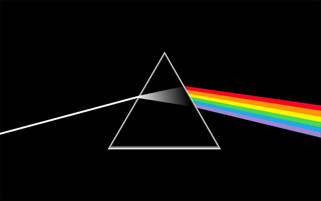
While minimal, it encapsulates the visual outcome of frequency-dependent decomposition of light — the auditory analogue of which we will look at in this article.
Newton’s discovery that white light can be split into its constituent colors and that the constituent colors can be combined back into white light (by passing the split light through an inverted prism) established without doubt that the colors of the spectrum come from the white light itself and are not artifacts imparted by the material of the prism. This idea that light can be split into a spectrum has had profound impact in modern science (think about spectroscopy, the method of detecting elements present in materials by splitting the light emitted by them — each element has a particular signature of frequencies of light that they emit upon heating).
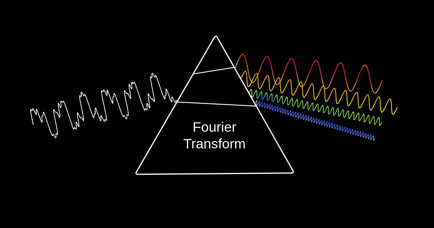
What if we pass sound through a “prism”? Like light, sound is also a wave and can be decomposed into its constituent waves with different frequencies. Fourier transform assumes the role of the “prism” in this case.
The central idea of the Fourier transform (FT) is that any wave (like sound) can be decomposed into a sum of simple sinusoidal waves. When FT is applied to sound, we obtain the frequencies, amplitudes, and phases of the contributing sinusoidal waves, which when added together gives us the original sound back. So, FT is an invertible function — we just need to do an inverse Fourier transform (like sticking an inverted second prism after the first to give us back white light) to get back the original sound.
That analogy is great and all, but to what end, you ask? Let us first see how a sound spectrum actually looks like.
The Plots Thicken
Take a look at the above picture again. Notice that the output side consists of four sinusoidal waves - each with a different frequency, amplitude, and phase.
Frequency refers to the number of cycles of the wave in a unit of time, measured in Hertz (Hz) or cycles per second (cps).
Amplitude refers to the peak value of the wave, how far it moves from its rest position. It represents the wave’s intensity.
Phase refers to the wave’s shift in time relative to a reference time. It could also be understood as the position within a single cycle, measured in degrees or radians.
The output of the FT are not the waves themselves but the phase and amplitude information about waves of a range of frequencies. Essentially, while an actual sound wave is described by its value at each time instant, the output of the FT gives us two sets of information that we can plot separately:
the magnitude plot — shows the amplitude of each frequency component
the phase plot — shows the phase of each frequency component.
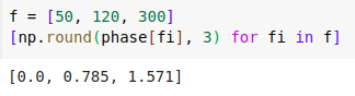
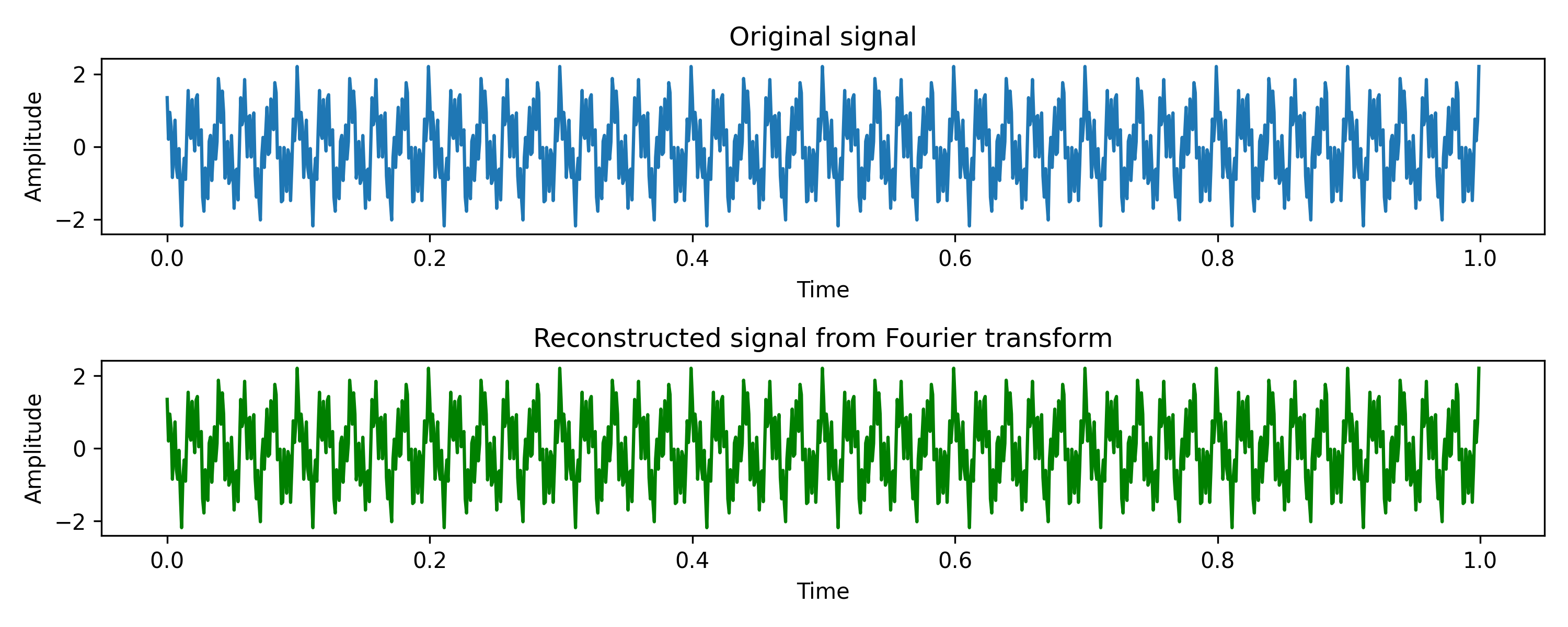
Let us now look at how these two plots actually look like. We will use Python (code here) to generate a signal composed of three sine waves of frequencies 50 Hz, 120 Hz, and 300 Hz and different amplitudes (1.0, 0.5, and 0.8) and phases (0.0, pi/4, and pi/2). Then we will compute the Fourier transform of the composite signal and plot the magnitude and phase plots.
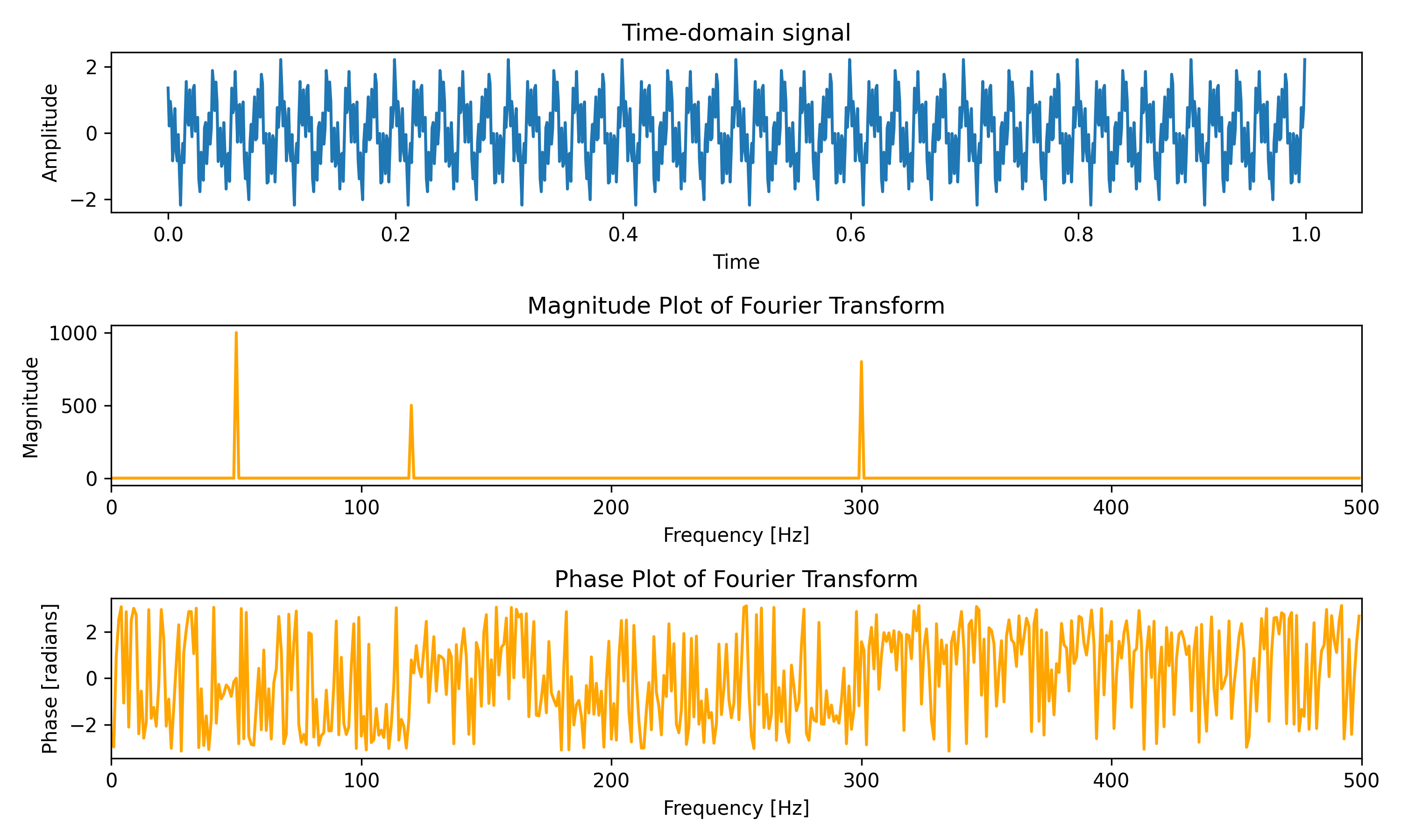
As expected, the time domain signal is a complex waveform and the magnitude plot shows peaks at the three frequencies which constitute the waveform. For the phase plot, if we read out the phase values at the relevant frequencies, we get the expected phase values (for the non-existent frequencies, the phase values are random1).
Now, akin to inverting the prism, we can pass the magnitude and phase information through an inverse Fourier transform function to get back the original waveform. Here it is:
Unwrapping Time
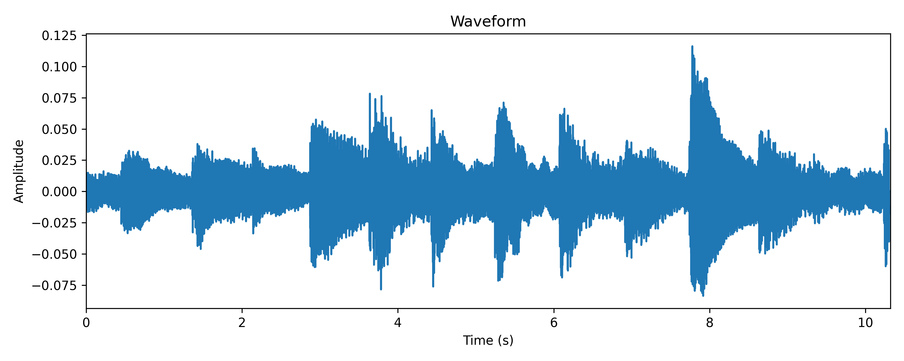
Real-world processes producing sound are typically non-stationary, i.e., their statistical properties change over time, thus producing signals that change over time. In simpler words, how a sound waveform (and its FT) looks changes over time — in speech, music, environmental sounds, etc, each window of time may contain different acoustic content — and in many audio analysis tasks, we are interested in this temporal variation of acoustic content.
We may want to convert recorded speech into text, thus entailing recognizing which phonemes are spoken at which times.
We may want to recognize patterns in audio recordings from forests to identify when certain birds are calling.
We may want to analyze musical audio tracks to identify its tempo and locate the beats and chord changes.
(and many more)
In such cases, it is beneficial to incorporate the temporal aspect into visualizing the Fourier transform as well, along with the frequency information. Together, these two dimensions capture much of the relevant information in an audio signal. This is done by a process called Short-Time Fourier Transform, or STFT in short.
The STFT is a method of obtaining time-frequency distributions, which specify an amplitude for each time and frequency coordinate. Understanding the STFT process is pretty intuitive (without even getting into the mathematical definitions). Imagine having a stream of audio signal, slicing up the audio stream into short intervals (say 5 milliseconds each) and computing the Fourier transform of each slice at a time. Then when you stack up the Fourier transforms you can visualize how the frequency components evolve over each time slice. You will essentially get a 3-D plot with the time and frequency as the first two axes and the amplitude magnitude as the third. Typically instead of plotting it as a 3-D plot, we use color to denote the magnitude on a 2-D time-frequency plane.
One effect of slicing the signal is that you get discontinuities at the boundaries where the signal appears as being cut off suddenly, resulting in a smearing effect in the computed Fourier transform. To minimize this smearing effect, we multiply each slice with a window function, which smooths the signal out at the edges. Going deeper into this topic is out of scope for this post, but I’d highly recommend going through this document that explains Fourier transforms and windowing nicely.
For now, let us finally see a spectrogram — the time-frequency-amplitude representation of a signal. We will only deal with the magnitude spectrogram here, since it is more interesting and informative than the phase spectrogram.
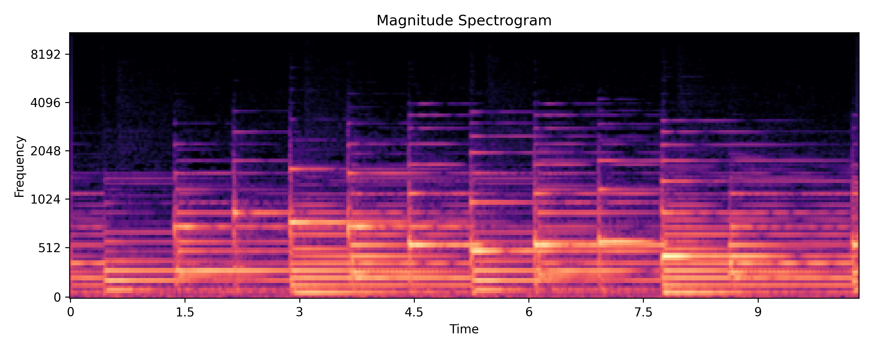
The brighter the color, the greater is the magnitude at that time and frequency. Notice that the frequency axis is logarithmic.
Spectrogram Sleuth
Looking at the spectrogram above, you can immediately gather a few salient pieces of information. Perhaps you will notice the following:
There are some vertical and several horizontal lines
Most of the energy of the signal is concentrated towards the bottom half (lower frequencies)
If you listen to the audio and count the number of notes played, it would match the number of vertical lines
If you listen to the audio and follow the melody, you may notice that it roughly follows the brightest horizontal lines
Perhaps the most important features that are apparent in a spectrogram (and lacking in a waveform) are the pitch and timbre information. The harmonics of a note (frequency components in multiples of the lowest, fundamental, frequency) are disentangled and shown as horizontal lines stacked vertically. The fundamental frequency determines the pitch of the played note and the pattern of harmonics is unique for every musical instrument and voice.
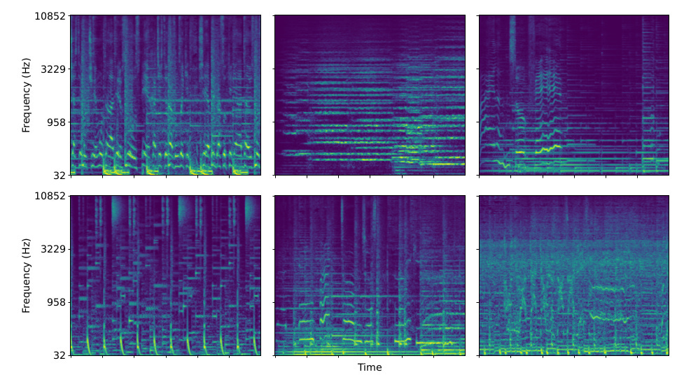
There are many more features that become apparent once you look at several spectrograms:
I highly recommend going over to this link where you can visualize a spectrogram from sounds captured using your device’s microphone in real-time.
When I started learning about spectrograms years ago, it opened an entire new world for me — it felt like the union of two of my senses: vision and audition. I had great fun in playing detective and figuring out patterns in spectrograms, and often also trying to guess what’s happening in an audio clip by only looking at its spectrogram.
Turns out, that is the reason why spectrograms are such amazing feature representations for audio analysis applications, and more recently even audio synthesis/generation applications.
Eyes and Ears
Vision is perhaps the most obvious sensory experience that we think of when we think about how we build our perception of the world. We create world models of our surroundings largely through vision, we read books and look at diagrams to understand difficult concepts, and we communicate through visual cues like facial expressions and body language. It is thus not surprising that a lot of the initial research of artificial intelligence for perception went into developing machines that can “see”. As a result, we were able to develop algorithms that can do visual recognition really well — for example, LeNet in 1998 for reading handwritten digits, and AlexNet in 2012 for recognizing image classes. There has been a massive explosion in computer vision algorithms since then.
It took a small flight of imagination to realize that models built for detecting patterns in real-world images might work well for detecting patterns in spectrogram images also. Convolutional neural networks (CNNs), originally developed for visual pattern recognition (LeNet, AlexNet, etc.) have been very successful in auditory recognition such as musical genre recognition.
Since then, CNN and its variants have been used widely in sound analysis and even sound generation, enabled by spectrograms. Spectrograms do not only provide a feature representation for visual classification, they are also extremely useful for many other applications: from noise cancellation to music production.
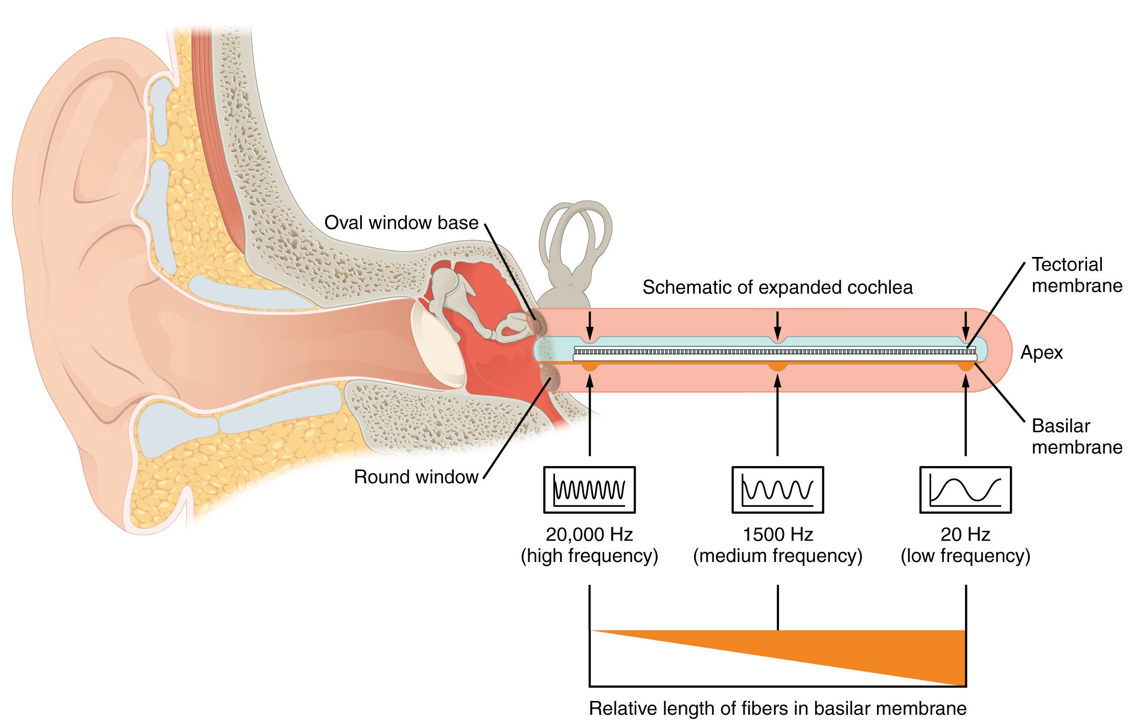
The ubiquity of spectrograms for audio perception tasks is a subtle reminder of the fact that our inner ears also perform a kind of real-time spectrogram computation — via the basilar membrane. The basilar membrane is a small curled membrane in our inner ear that has a tapering structure: thick and flexible on one end and thin and stiff on the other. As a result, different points on the membrane resonate at different frequencies. The neurons attached to the hair cells around the membrane sense these different resonances, thus splitting the sense of sound across different frequencies.
If all of this talk about visualizing sound has kept you interested thus far, I’d recommend the following to dive deeper into this topic.
This blog post about different kinds of spectrograms.
Julius O. Smith’s lovely book on signal processing.
The Scientist and Engineer’s Guide to Digital Signal Processing. A great (and free) book to learn about Fourier Transforms, spectra, and general signal processing methods, including those used in image processing and other applications.
Hearing: An Introduction to Psychological and Physiological Acoustics, by Stanley Gelfand. If you are more interested to learn about how the biological hearing system works.
This post was intended to be the tip of the iceberg for sound visualization. I hope you learned something new, or saw some things through a new perspective, just as spectrograms allow us to look at sound with a different perspective.
Random phases is an artifact of computation. Since the computation is done numerically, small errors are bound to be introduced in the computation. The output of the Fourier transform function in Python gives us high magnitude values for the constituent frequencies, but for all other frequencies, it gives extremely small values with random phases.
https://musiclab.chromeexperiments.com/Spectrogram/
Nice. Check out: https://towardsdatascience.com/human-like-machine-hearing-with-ai-1-3-a5713af6e2f8